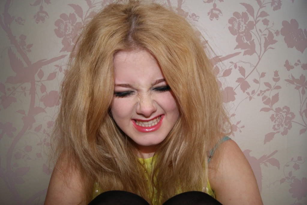
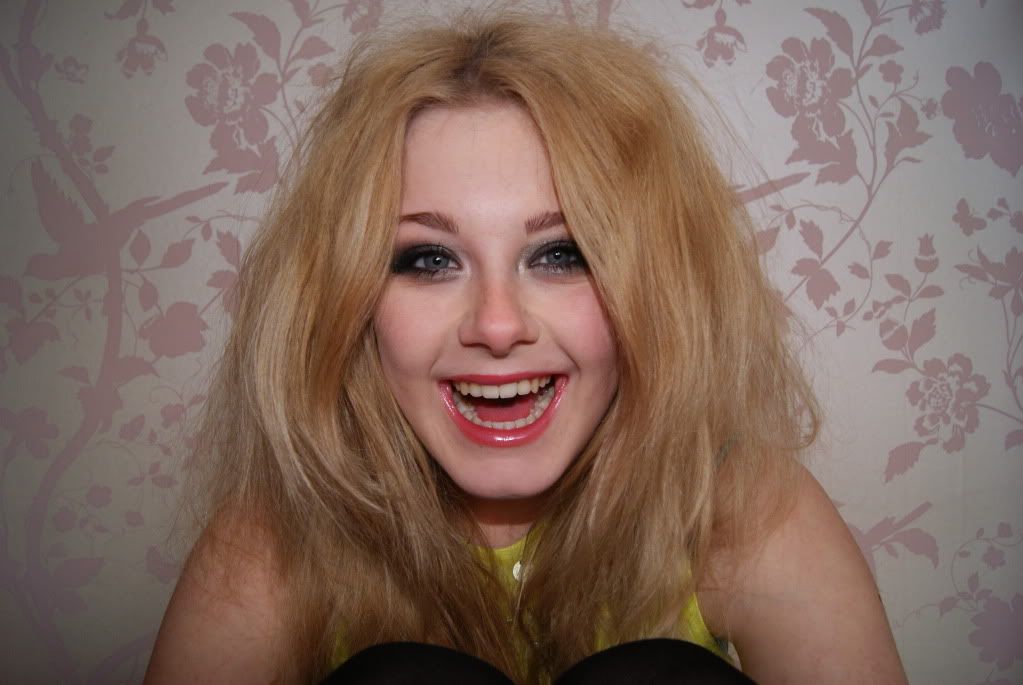
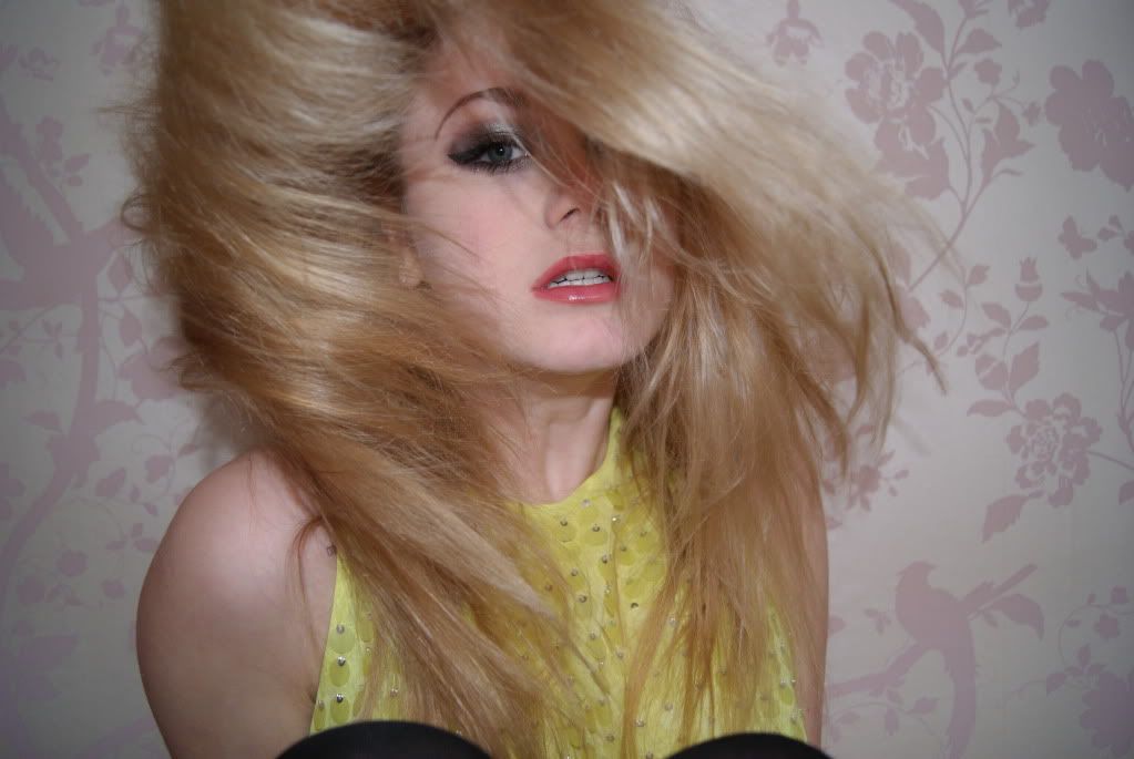
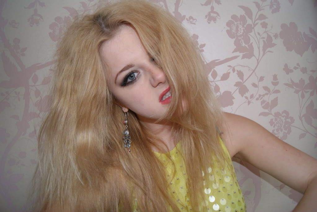
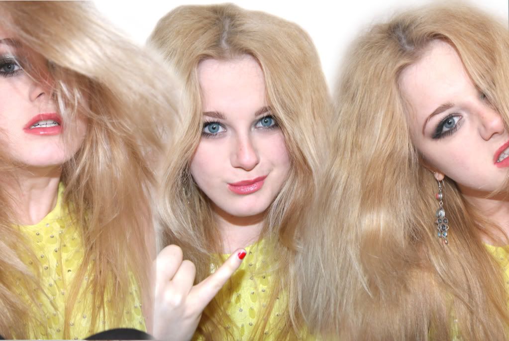
Here I have created 3 images into one to feature on my double page spread.
Firstly I lightened and contrasted the three separate pictures to make them have an almost cartoon affect, and to also make the picture stand out more and look attractive to the eye.
I firstly took image of me laughing and left it as the base for all three images, and then took the two images and used the Lasso tool. I guided this tool around the image, almost like cutting the image out, (image was my body/face) Once I done this I copied it onto the image of me laughing and put it next to my face and now it looks like there are three of me together which looks really good. After doing this I used the blur tool around my figure to make it blend in to make it look more lifelike.
I decided to put the whole image as half a page, as from my experience, I find it more likely to be readable as the whole image draws in the attention.
I put splashed paint as a theme of the magazine as I find that it resembles teenagers, as the paint is not neat and almost spare of the moment but holds attitude. This process is a very creative one, and I had to pull in my artistic skills to make this process a success. The demographic I am aiming my magazine at include 'creative and experimentalist' lifestyle types, and I think this is a process that fits well.
Seeing as I’m doing an Indie magazine, I thought my look was really important to get the feel of the genre in my images. I backcombed my hair, did my makeup smokey and dark and wore a bright top. Overall I find my image fashionable and eye catching and would draw in the audience’s attention.
Here is my first double page spread
Here is my final double page spread
Before my final double page spread, I did one other, but I didnt like it as it seemed unprofessional and the font made it look cheap as well as the background.
With my article I made it purposely informal with a chatty tone added with humour as I find this is what I like to read and what most teens and young adults would like to read. I used personal pronouns to make the article personal to the readers and to form a relationship almost.
I decided to make the interviewer and Jennie (me) have a believable and real personality by making them have a sense of humour and to be normal people despite the celebrity status. I find that reading about a celebrity who is real and down to earth a lot more interesting than a celeb that isn’t.
I used relatable subjects within the article such as “Topshop” and “Paramore” so the readers can relate to it. I also used slang as teens/young adults use this such as “random bloke” “bobs your uncle” and “yay” I find that using language like this makes the whole article not resent able but pleasant.
With the front cover I thought that this page needed to be the most important as in this case you do judge a book by its cover. And so I thought that a closeup picture of me seeing as I am the main feature of the magazine.
I took the picture myself, I put my SLR on self timer and leaned against my wall and flicked my hair, and it looked really good so I thought it would be appropriate for a front cover picture. I didn’t just leave the colour normal, I once again adjusted the lightness and contrast to make the colours a lot brighter and eye catching.
The first front cover

The final front cover
I did one front cover first and added more to it as I felt it wasnt giving away enough information about the magazine, but not loads of information as it will give the magazine away. And so I added more subheadings.
I decided to call the magazine Exposure as I felt that the title explains itself, exposing artists and music. I put a pull quote on the front from the interview to draw in the readers to read the interview.
I used the imperative “win” at the front, which commands the audience to enter the competition. Seeing as this is an indie magazine for teens/young adults who aspire and like that genre of music, and thought it appropriate to have a competition to win a signed guitar, as this instrument is what is used to make this genre of music.
The other subheadings I have involved what’s in the magazines, the important topics. Such as Festivals as this season is nearing summer and festivals are coming up, people would want to hear the low down about this topic as most people will be going to this big event.
Also the font I used I got from two websites called http://www.1001freefonts.com/ and http://www.dafont.com/ I decided to use two main fonts called Brushed and Masterplan. I thought these suited the whole genre of my magazine and the whole look of it too. It’s bold, edgy and gives an Indie affect. Its eye catching too which will draw the audience in. To make the magazine more professional, I put the prices from UK or USA on with date and barcode which makes it look more realistic.
I continued the font and the theme of the magazine onto my contents. I thought that by having splashed paint and stripes as the background, it would look trendy and eye catching, which it does.
With the title, contents, I coloured in the S at the end via the paint programme.
I put a lot of paint splashing on the contents to make the feel of the magazine to be uncontrollable, like teens, and to set the mood of the magazine, that its not totally formal.
Heres the first draft of my contents.
Here is my final contents page
Before my final contents I did one other. The first one was unprofessional and seemed over crowded with pictures which didnt look good. I made it less crowded but kept the theme within the contents and now looks much better than before. I chose to feature two more people rather than just one artist. One of them being a boy as I didnt want the magazine to look just for women, even though the issue is the "women issue".
Again with the image of me I put three images into one, this saves space on the page yet adds affect.
In the actual contents, I tried to make the selection of pages have different topics but within the same genre, to do with Indie and music. I thought if the whole magazine was all about music, it could get a bit boring and so I added in musicians on politics, fashion, behind the scenes ect.
----
In my magazine there are codes and conventions that make up the genre and the magazine.
There are specific features that you would expect from the genre Indie, and these features help create the genre and communicate ideas to the audience.
But what did I use to do this?
With my front cover I used a young, modern and fashionable picture, which shows the whole face of the artist, portrait. This is what you would expect on the front page of a magazine, an image that captures attention for the audience to pick up the magazine. But what to expect from a specific genre like indie. Bright, contrasted images with a bold, almost graffiti-like font. My magazine holds this theme through out the pages. I think the genre is recognizable in my magazine.
Conventions are what make my magazine a magazine, such as on the front pages i have included subheadings, title, barcode and prices. With the contents I have put a large title, page numbers featuring what is on those pages and a few pictures to show what are on the pages to draw the audience in. This page is important as it almost advertises the whole magazine. The double page spread I have the feature artist on half of the page which is what you would expect, a large image of the feature, also with an article, a question answer article, beside it interviewing the artist. These conventions that I have talked about are what you would expect in a magazine.
As for the codes in my magazine, I find that this is done. The fonts I have used tell the audience that this magazine isn't elegant or polite, its the opposite which is what teenagers like and what some are like with their personality. Also the font is graffiti like, same with the splashed paint, this represents what our culture has become. Uneasy, a bit messy. This feature communicate this to the audience making it clear that this magazine isn't for those who are educated, maybe high class and older. The images I have used of the artists featured communicate to the audience that this magazine is for teenagers as the pictures are of teenagers, which can make the whole magazine relatable to the audience making the magazine more sellable and a successful product. Also the images used aren't posed and elegant, but rough, indie and shows off the artists personality which makes it more personal to the audience, almost forms a relationship.
What have I learnt since the preliminary task?
When I did my first magazine using photoshop, I didnt know what to do, I had to learn the features, how and when to use them and what on. Practicing this every media lesson on my second magazine has made me become fully aware of most of the features. Seeing as I researched a lot into magazines and what techniques they use and analyzed them, this has helped me with my magazine.
Seeing as I re-done the contents and double page spread after I eventually got to use with the features, I have improved since. My imagination for my magazine had grown and I wanted to put all of it into my magazine. I found that the second time round doing my contents and double page spread to be a lot better and a lot more professional looking.
Looking back on my preliminary task when I did my first magazine, you can see my improvement. But not only with my skills on photoshop, but my photography skills and my knowledge/imagination.
Back then I had just brought my SLR camera and I didnt know the features on it too well and how to use it to get the right affect. Seeing now on my magazine my photos look more professional and full of quality which I find important to a magazine. The photos are what people see first unlike text as you have to read that to get the whole idea.
I also gained a lot more knowledge of my genre and target audience. Seeing as the genre draws in the audience if its what they like, the magazine has to cater for their needs. I researched a lot into Indie and learnt what works and what doesn't and what I have to do. With taking pictures of myself I had to have a whole rock/indie look to suit the genre, and it worked well due to the fact that I now know what I have to do to my magazine to make it suit the genre.
----
Overall I found this project exciting and interesting and I really enjoyed it. I liked gaining information about the whole magazine and what is involved in it and such. I have learnt to deeply think about the techniques and element to be put into a magazine and Im sure this will help me in the future as its already improved my knowledge already.
Seeing as I have a natural interest in art, I found taking the pictures for my magazine really enjoyable. Also tweaking them using photoshop and lightening them and contrasting interesting. I have now gained skills for the future which will help me with other tasks in the making.
By doing this whole task, I found that I really enjoy media and that I would consider doing it in the future and even to study it further at uni.
I found this whole task challenging but a bit easy at times.
The challenging part was to find the information to write about and to learn how to use photo shop as ive never done something like this before. But as for writing about everything, I found it enjoyable as I have actually gained knowledge into analyzing. Seeing as I study art and english language, I could put my skills and knowledge into this subject which made it a little bit more easier for me.
I would consider doing print based work again with my new and improved skills.
I think that my magazine is truly good and that I have worked hard on this project and hopefully my work will get recognized for it.
---


